2.1.4 Common Configuration
OPENMARU Cloud APM screen configuration and common features
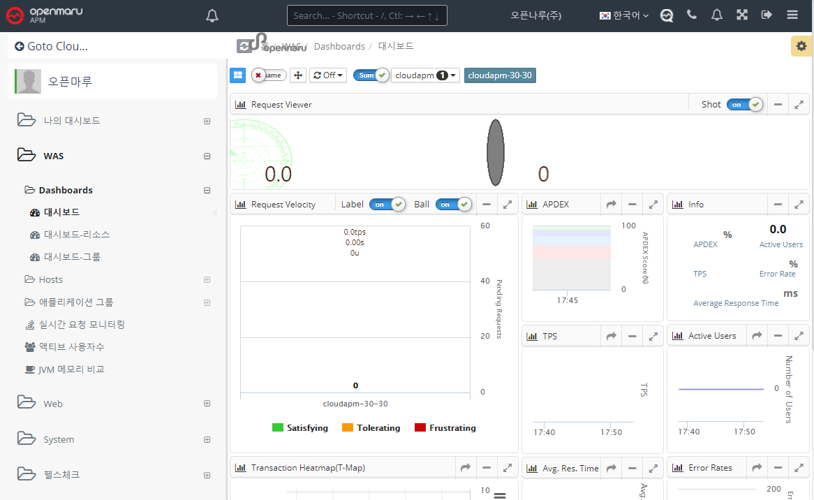
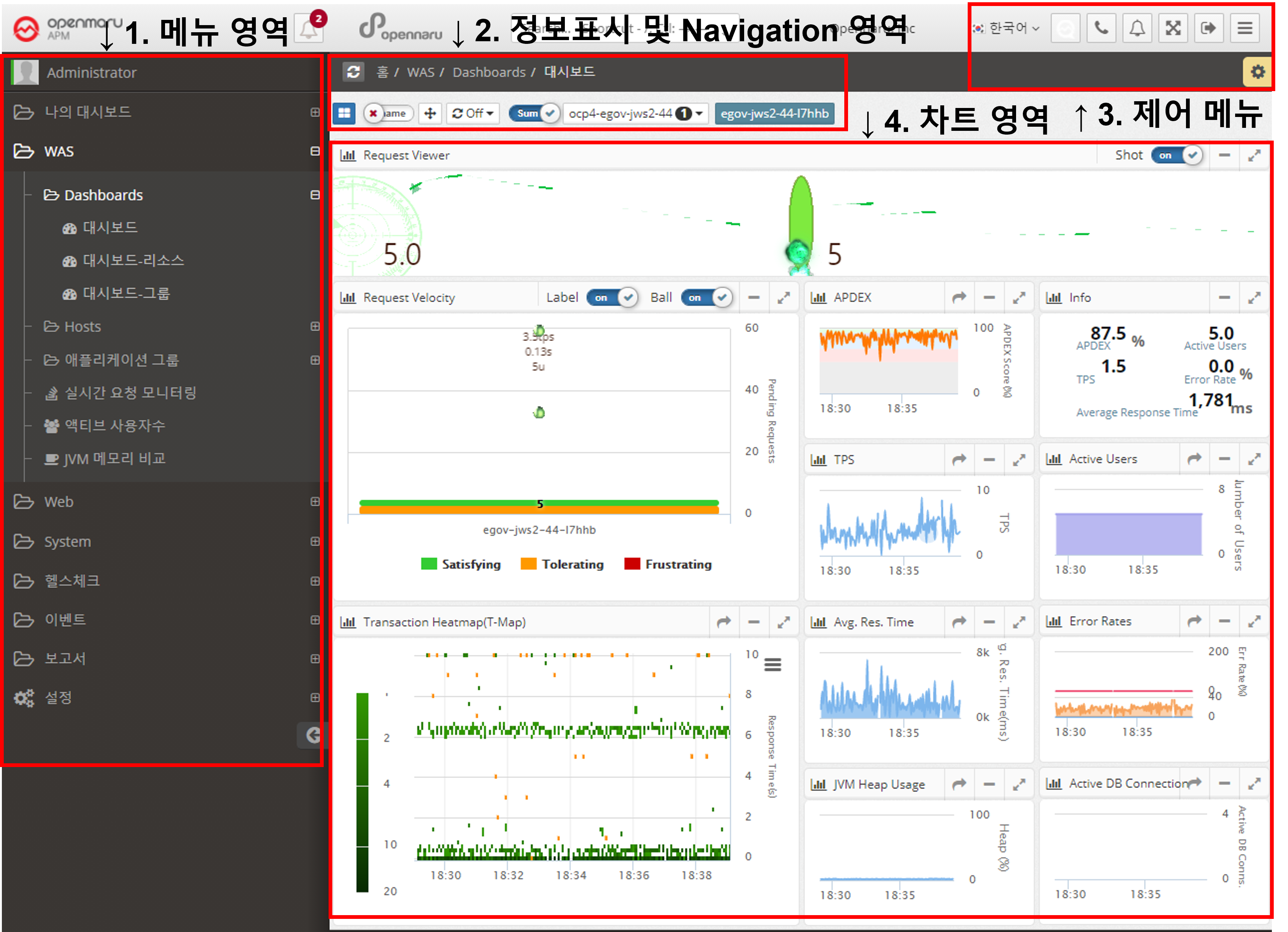
Layout of OPENMARU Cloud APM screen
-
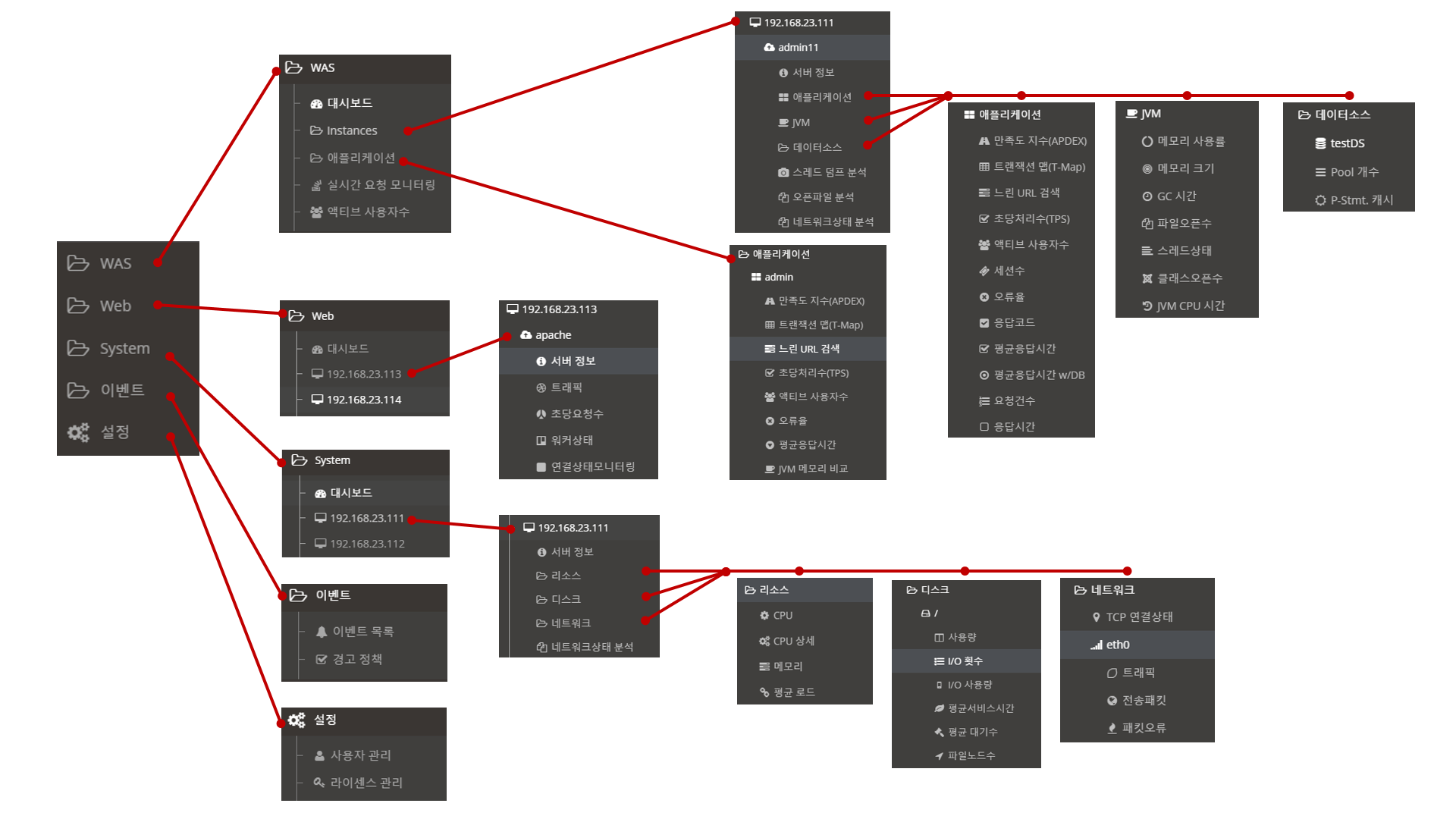
Menu area : An area that displays a menu where you can browse the information under WAS, WEB, SYS.
-
*Information display and navigation area: Displays the location of the selected menu and buttons to move between application groups and instances for the information.
-
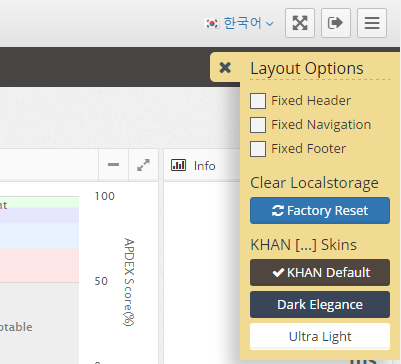
*Control menu: Displays menus for language selection, full screen, logout, hide menu, settings, etc.
-
Chart area : This is the area where the chart corresponding to the selected menu is displayed.
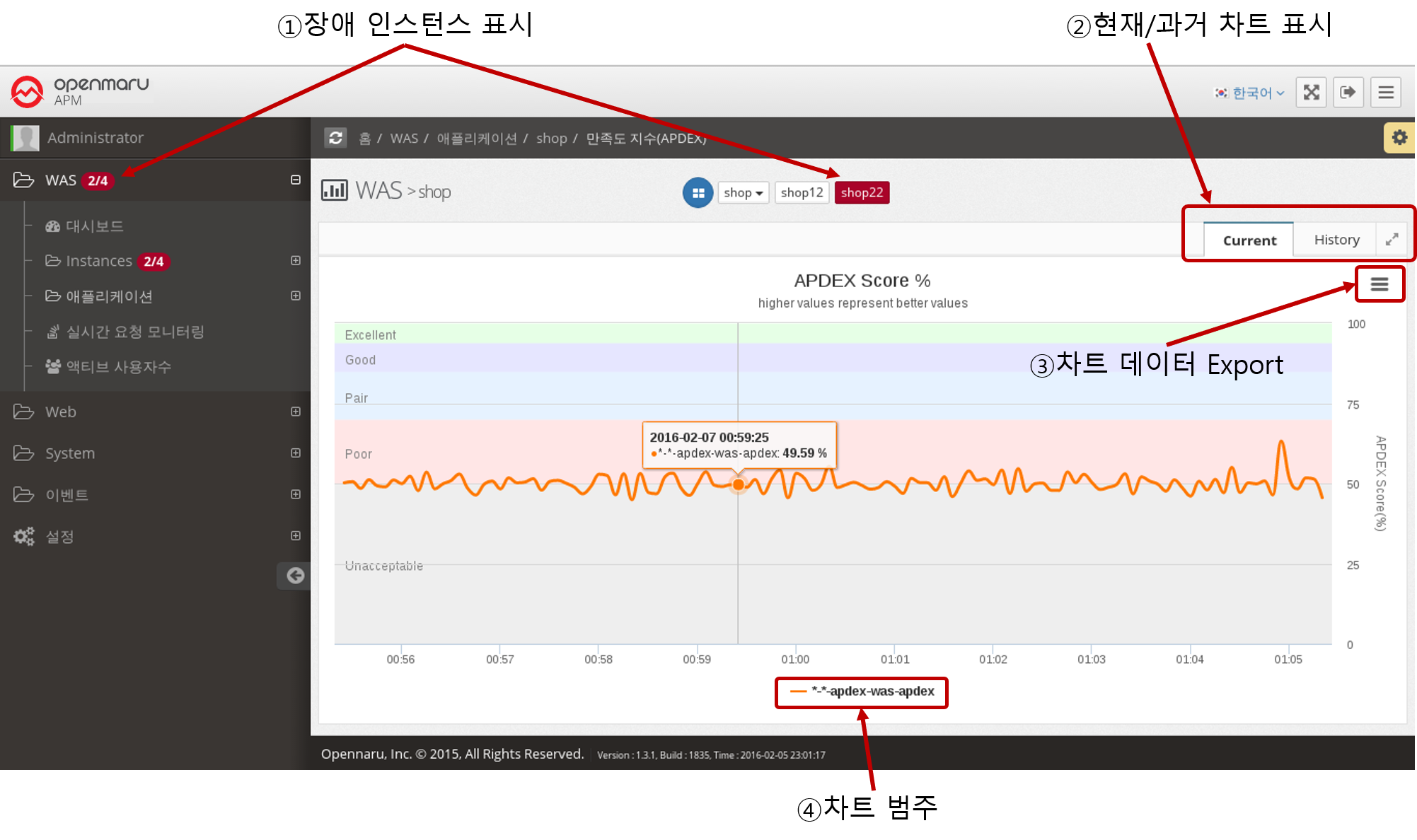
Current chart screen layout
 .
.
-
Display Failed Instances : If there are currently failed instances in the menu area, it displays the failed instances in the form of 'Failed Instance Count / Total Instance Count', and also displays the currently failed instances in red in the Navigation area. The Instance menu displays 'STOP' for WAS instances that are not currently running.
-
*Show current/past chart: Provides a menu to view the current chart and historical data. The current chart is automatically updated every 5 seconds.
-
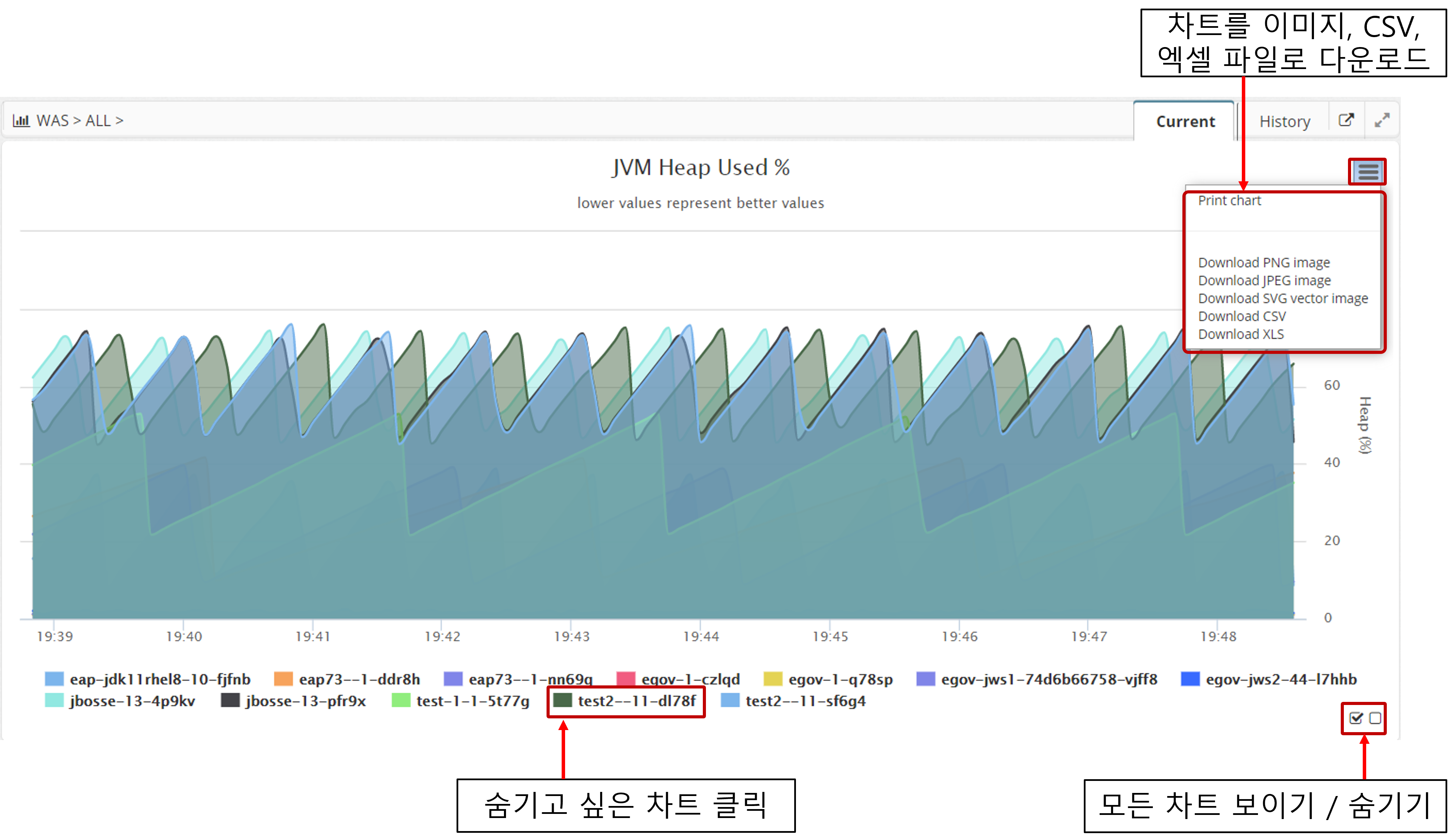
*Export Chart Data: All charts provide a menu to export the graph currently displayed on the screen to PNG, JPEG, SVG, CSV, and XLS data formats.
-
*Chart Category: Displays the chart’s data category. You can toggle the categories to show or not show the chart data.
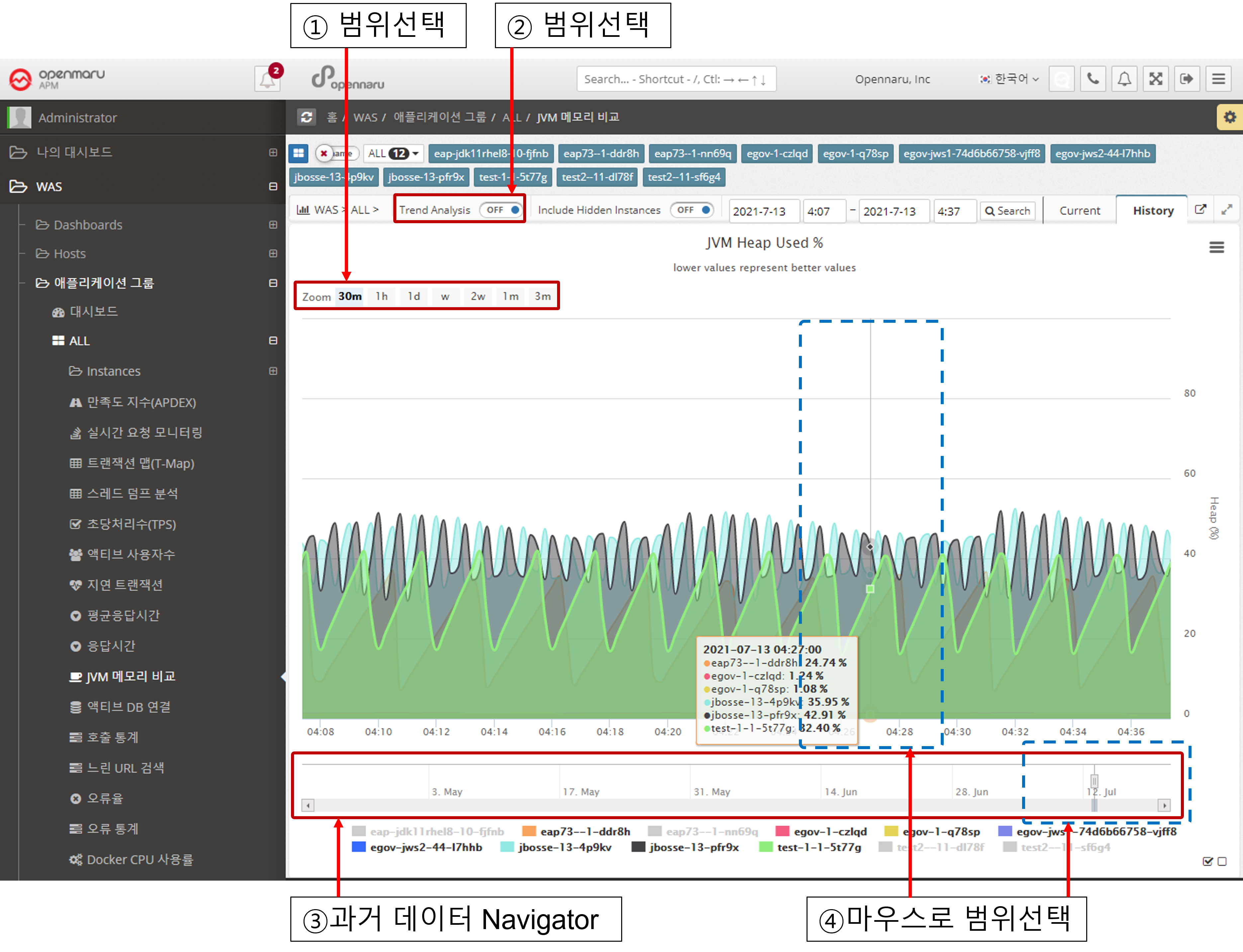
History Chart Layout
 .
.
-
*Select Range: You can select the graph display range for 30 minutes, 1 hour, 1 day, 1 month, and All.
-
Trend Analysis : For the History chart, a menu is displayed to analyze the trend of the graph.
-
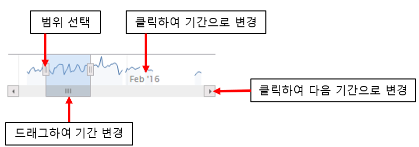
*Historical Data Navigator: Displays all data for the past 90 days.
-
*Select Range with Mouse: In the Chart area, select and drag the graph area you want to see in more detail with the mouse to enlarge the data in that area. In Navigator, you can also select the time you want to view and the data for that time will be displayed. You can also analyze the data by expanding or contracting the range of the currently displayed area left or right. ++And
Selecting a chart legend and exporting data
This feature is common to all Current and History charts.
Clicking on the legend at the bottom of the chart will make it invisible. You can also hide or show the entire chart by selecting the icon at the bottom right.
You can download the graph currently displayed on the screen as a PNG, JPEG, or SVG image, or as a CSV or Excel (XLS) file.
Data Trending Features
This feature is common to all History charts.
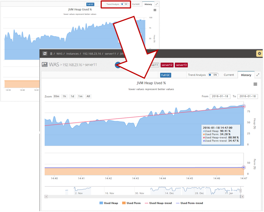
Since most of the monitoring data is measuring changes in data values over time, analyzing the trend of changes over time can help you predict what will happen in the future.
In particular, if you have a memory leak in your Java virtual machine, you should see a gradual increase in JVM utilization. All History charts have a Trend Analysis button, which, when clicked, displays a trend line for the data as a straight line on the graph screen. By looking at the slope of the line, you can easily see if the trend is increasing or decreasing.
Chart Navigation
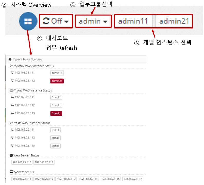
This is a common area at the top of the user interface that provides the following features.
 .
.
-
*System Overview: View the overall configuration of the monitored system. Failed instances are colored red.
-
Dashboard Task Refresh : Displayed only on the WAS dashboard, it refreshes and displays the dashboard by task in the selected time unit (1 minute to 10 minutes).
-
Select Workgroup : When you select a workgroup, ④ Individual instances are changed to that workgroup. When you change the business group, the charts displayed in WAS > Applications are changed to the charts for that business system.
-
Select an individual instance : Click an individual instance in the WAS > Instance submenu, WEB > IP > submenu, or System > IP > submenu to display the chart of that instance.